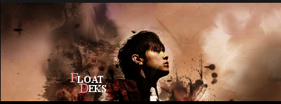


New one made for robbd any thoughts? tried to take wars advice on my last one and blend in the render more
EDIT: Also this one


Moderator: GFX Staff


Angela Merkel wrote:Das Internet ist für uns alle #Neuland.
Yeah so trueDrift wrote:Its pretty good for a first attempt, but I think that the text doesn't really fit with the image and blends in too much with the background. For example the Dot part is hard to see because of the blending in.


Yeah, indeed. I did not have time (and i did not wantGraphiix wrote: And War, I really like your, like I said in the request topic he made, but just seen here that the render seems to be sadly rendered, on his hair, looks like a white splash or something?


Nice rendering :D not sure if you rendered it or somebody elseWar wrote:I don't really like this one Deks, a bit too empty on the left side, the head is small and the eye doesn not catch to it. And lights are not that good.
You made better ones. :)
What's the tuto btw?
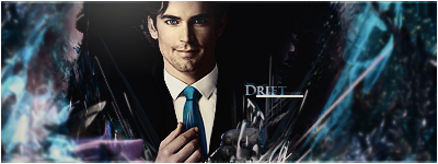
Drift's one
What do you think ?