

Signatures
Moderator: GFX Staff

-
iStarZy
- Posts: 2041
- Joined: Thu Aug 20, 2009 1:56 am
- STEAM: iStarzy
- BATTLE.NET: Jack#21529
- LoL Name: iFailzy
- Location: England
Re: Signatures
Thank you. Before anyone says, even as a joke (It's not funny). I didn't rip it.icestormy wrote:Woot man, this one is really beautiful :)


Re: Signatures
Really nice. Though I don't like the non-fitting text on it... try a different font/color.

[18:30] -=TAG=-Snoop: Okay, Thank you, and sorry for interrupting your ingenious laboratory work Professor Vash.
Re: Signatures
The text makes it kinda special. Stop posting crap on forums if you don't have any clue about GFX. Thanks!Vash wrote:Really nice. Though I don't like the non-fitting text on it... try a different font/color.
Re: Signatures
The text isn't getting special by using it on 100 other sigs. That brings me to the thought that you are the one who doesn't have any clue about GFX.
[18:30] -=TAG=-Snoop: Okay, Thank you, and sorry for interrupting your ingenious laboratory work Professor Vash.
-
Numb

- Omicron Major

- Posts: 6290
- Joined: Sun Oct 19, 2008 8:32 pm
- LoL Name: Hveem
- Location: Norway
- Contact:
Re: Signatures
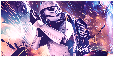
Woot, great signature man! Definitely your best. 
Though I agree with Vash; the text doesn't fit. Change the colors and it will look a lot better. Maybe you can use the redish color from your focal's eyes on one of the texts, and a more light bluish color on the other one.
Other than that, the tag is nonetheless. Keep up the good work. ;)
Though I agree with Vash; the text doesn't fit. Change the colors and it will look a lot better. Maybe you can use the redish color from your focal's eyes on one of the texts, and a more light bluish color on the other one.
Other than that, the tag is nonetheless. Keep up the good work. ;)


Re: Signatures
I love this render, i tried to make a sig with it, but i failed.iStarZy wrote:

Awesome one.
"Chaos isn't a pit. Chaos is a ladder. Many who try to climb it fail, and never get to try again. The fall breaks them. And some, given a chance to climb, they refuse. They cling to the realm, or the gods, or love. Illusions. Only the ladder is real. The climb is all there is."
-
TheSold3y

- Posts: 2896
- Joined: Fri Sep 18, 2009 10:27 pm
- STEAM: svengiesselmann
- BATTLE.NET: Sold3y
- LoL Name: TheSold3y
- Location: Mhm...
- Contact:
Re: Signatures
Woot edited by Starzy?Acer wrote:The text makes it kinda special. Stop posting crap on forums if you don't have any clue about GFX. Thanks!Vash wrote:Really nice. Though I don't like the non-fitting text on it... try a different font/color.

-
iStarZy
- Posts: 2041
- Joined: Thu Aug 20, 2009 1:56 am
- STEAM: iStarzy
- BATTLE.NET: Jack#21529
- LoL Name: iFailzy
- Location: England
Re: Signatures
What?Soldy' wrote:Woot edited by Starzy?Acer wrote:The text makes it kinda special. Stop posting crap on forums if you don't have any clue about GFX. Thanks!Vash wrote:Really nice. Though I don't like the non-fitting text on it... try a different font/color.

Re: Signatures
hihi I was joking ;-)Vash wrote:The text isn't getting special by using it on 100 other sigs. That brings me to the thought that you are the one who doesn't have any clue about GFX.
Just wanted to see how you react xD
-
Graphiix

- Veteran

- Posts: 2455
- Joined: Tue Feb 03, 2009 8:39 pm
- STEAM: Milouexotic
- BATTLE.NET: Graphiix
- XBOX Gamertag: Nexo Graphx
- LoL Name: Graphiix
- Location: France
- Contact:
Re: Signatures
In red the text appear a bit better with eyes :)
But this sig is really beautifull with a blue or red text :D
Really nice job Starzy! Like it :P
But this sig is really beautifull with a blue or red text :D
Really nice job Starzy! Like it :P
„ « TeamXtreme
Wikkid » “

Wikkid » “
Re: Signatures
Better color, shitty font... you have to "go with the style" if you know what I mean.
[18:30] -=TAG=-Snoop: Okay, Thank you, and sorry for interrupting your ingenious laboratory work Professor Vash.