Some suggestions: I don't like this white crap under his face ... Idk, it doesn't fit to the sig at all. And please try to have better borders, because it doesn't look that good.
well, border shouldnt be that hard, and i dont want to discribe how to make borders.lawl. but the first 1 is kinda cool same at the bottom and it would be better. or just use a normal one.
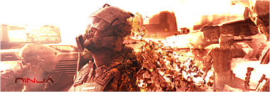
v1 is way better.
but there some things you should rly take care of.
1. you can not just put some brushes or whatever above your render which look just like the background. in general: only brush above your render if it fits. if not, leave it.-->no bad idea but these things on the left side should rly go with the flow and not just stay there as overlay.
2. the effects you chose.. well at least the colors should fit. brown background, blue, purple effects and a green render in the middle?
+ some part of the purple stuff should go on a layer above the render.
3. some smudging and ereasing can make a huuuuge difference.
(right upper side of the cloak, left side, bottom left of body and maybe on his "ears".
4. use blur & sharpen tool.
-> face sharp, part of the left ear, shoulder some of the left parts of the cloak and maybe some blur on the belt.
what is beyond those parts, meaning behind those parts, -> blur. but not everything, would be kind of a mess.
5. try not to use those brush-backgrounds
thats all so far, just with some few tricks, this sig should look rly great cuz it has vry much potential, if you decide to try some of my tips, would be great if you post the outcome well done.