
Here is it :

If you could say me what's is wrong, it would be cool ^^

Moderator: GFX Staff


Republic Commando Trues Colors:
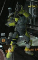
Scorch: w00t!!!!! Look !
Sev: It's a fish Scorch. You will get used, the fish also.


Republic Commando Trues Colors:
Scorch: w00t!!!!! Look !
Sev: It's a fish Scorch. You will get used, the fish also.


