


Uhh abstract
Moderator: GFX Staff


Re: Uhh abstract
got inspired by numb? kinda looks like the one he made for hasero ;P
but,
>text is awful
raster doesnt fit.
red lines are hust annoying.
maybe just white bg? or black idk your sig. or yellow..

just some ideas, think of it
but,
>text is awful
raster doesnt fit.
red lines are hust annoying.
maybe just white bg? or black idk your sig. or yellow..
just some ideas, think of it
-
Swippy

- Alliance Member

- Posts: 1297
- Joined: Sat Apr 12, 2008 9:56 pm
- BATTLE.NET: Niggipuh.542
- Location: Germany - Near Hamburg
Re: Uhh abstract
Hmm.
U give nice feedbacks
Ye it was my 2nd abstract one, i think i will try a bit ;D
U give nice feedbacks
Ye it was my 2nd abstract one, i think i will try a bit ;D


Re: Uhh abstract
i do my best.
but this one is quite good actually, just fix some things like i posted and you can do much more bc you have the original psd file and just keep on doing, soon you'll get even better.
and remember, sometimes sometimes a little less is even more.
but this one is quite good actually, just fix some things like i posted and you can do much more bc you have the original psd file
and remember, sometimes sometimes a little less is even more.

-
Numb
- Omicron Major

- Posts: 6290
- Joined: Sun Oct 19, 2008 8:32 pm
- LoL Name: Hveem
- Location: Norway
- Contact:
Re: Uhh abstract
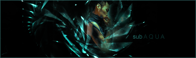
Not too bad to be your second try.
Mix around with a lot of brushes and diffrent colors, just make sure you make a lot of layers*. As you can see on your signature, i have made color steps from blue -> purple etc. You may try that out, I liked the result though.
And yeah, black background doesn't work that good on most signatures. Try making a soft background instead.
An example (didn't add too much brushes, but just to show you how to blend colors etc:

Add more stuff like I started here, and the result will turn out good!
Mix around with a lot of brushes and diffrent colors, just make sure you make a lot of layers*. As you can see on your signature, i have made color steps from blue -> purple etc. You may try that out, I liked the result though.
And yeah, black background doesn't work that good on most signatures. Try making a soft background instead.
An example (didn't add too much brushes, but just to show you how to blend colors etc:
Add more stuff like I started here, and the result will turn out good!

Re: Uhh abstract
nice one numb.
tho id like to add a few more things:
the blue thing doesnt work out, colors are tooo shiny and hard, and for the beginning, go with arial 9-12 before using such fonts. (and the angel or whatever that should be doesnt fit at all, lawl)
and i like the water effect of the bubbels but dont just do your bubbels over and over again try something new.
on most abstract sigs a real stock or real ppl work out but first youve to get over the shiny bubbles^
and try to follow the tips numb gave you, they're good.
idk how he did the one he just posted but id say he used lasso, brush, path tool and for the bg maybe some stocks or what ev. if it isnt selfmade.( if it is, its nice)
->correct me if im wrong numb
and the path tool always works out( look at the guitar in my sig), look for some basic tutorials.
(and if you finished your path, right click it and fill the outlines. make sure to set your brush to a standard 1-3px hard one before outfilling the lines. then you click on brush tool on the window which appears and click okay.)
tho id like to add a few more things:
the blue thing doesnt work out, colors are tooo shiny and hard, and for the beginning, go with arial 9-12 before using such fonts. (and the angel or whatever that should be doesnt fit at all, lawl)
and i like the water effect of the bubbels
on most abstract sigs a real stock or real ppl work out but first youve to get over the shiny bubbles^
and try to follow the tips numb gave you, they're good.
idk how he did the one he just posted but id say he used lasso, brush, path tool and for the bg maybe some stocks or what ev. if it isnt selfmade.( if it is, its nice)
->correct me if im wrong numb
and the path tool always works out( look at the guitar in my sig), look for some basic tutorials.
(and if you finished your path, right click it and fill the outlines. make sure to set your brush to a standard 1-3px hard one before outfilling the lines. then you click on brush tool on the window which appears and click okay.)
-
Numb
- Omicron Major
- Posts: 6290
- Joined: Sun Oct 19, 2008 8:32 pm
- LoL Name: Hveem
- Location: Norway
- Contact:
Re: Uhh abstract
Yep. The background is just brushed a little with an almost invicible stock at the top. Simplicity
The abstract part is mainy brushes -> Download LOTS, because you will need them to make good abstract signatures.
But as you said, I used the lasso tool as well.
Remember the layers*. As you can see, I've blended several parts of the signature. This makes a nice look imo. You don't need to focus on sircles the whole time eather. Add some, but try out something new like squares, wicked stuff etc.
Re: Uhh abstract
yeah brushes are important, hard to make something without em. (since my pc crushed i had to reinstall everything, all my brushes are gone now:( [what's rly bad bc i was used to the brush/c4d style] but the good thing is you learn vry many ways to figure out something new and create new stuff
tip: if your whole sig seems too "hard&shiny", add some gradient maps, mostly yellow/orange if you want to make it softer(but rly depends on the sig) on ~20-30% opacity. of course you can add more if you want to
you could use fotofilter+layerstyle+opacity too, but if you want to change something which is under that layer, you can't. working with gradient maps is always good. (on the right lower side click the black/white thing and then gradient map to add one)
or edit>adjust> photofilter or lighting&stuff like color regulations.(you usually do that when youre nearly finished)
hope you involve some of those things in your nest one


Re: Uhh abstract
Your first try is good...
Your second try is "great"
Your second try is "great"
]-TeamXtreme-[»'FReaK.™{OmicronLanceCorporal}
'7Lives.FReaK™


I get DEEP, I get DEEP, I get DEEP, I get DEEPER into this thing.
'7Lives.FReaK™
I get DEEP, I get DEEP, I get DEEP, I get DEEPER into this thing.